Whether you’re an Adobe Suite novice or a skilled designer, this tutorial will teach you how to vectorize your hand lettering so you can make your very own posters.
You may have been hand lettering for awhile now, learning the do’s and don’ts of how to form your letters. But now you want to up your game by knowing how to vectorize your hand lettering.
Although there are a ton of ways to digitize your lettering, I’m going to share how I vector my artwork so I can keep that same handmade look from my sketches using Photoshop and Illustrator.
WHAT YOU NEED TO VECTORIZE YOUR HAND LETTERING
Knowing how to vectorize your hand lettering is great when preparing your designs for print so you can sell your art or provide high-quality files for your clients. The best part of vectorizing your designs is that you can blow up your artwork as big as you want without having to get any nasty pixelation.
Before I get ahead of myself, there are a few things you need first to get started.

1. Download the Adobe Suite
If you are not ready for the $49.99/mo investment, you can download a free 30 days trial of Photoshop and Illustrator so you can test them out
Or if you are a current student you get an even better price point of $19.99, so you don’t have to live off as much Ramen to digitalize your lettering.
2. Properly Scan Your Images
A scanned version of your lettering is crucial when trying to get a clean version of your work onto the computer. I recommend scanning your hand lettering at a minimum of 300 DPI or 600 if your scanner as the option
It’s important NOT just to take an image on your phone to then upload to your computer. The typical DPI of phones (even the great iPhone6+) is just 72 DPI, which only works well when displayed on the web
The better resolution of your image, the more details will show up in Illustrator when we use Image Trace tool. So this is a vital step if you want to keep all your inked lines and decorations looking hand made.

I use a Canon PIXMA MG6320 Inkjet Mulatifunction Printer that also has the functionality of a scanner, but if you're low on funds, there are a bunch of other options too.

I found this Canon 0307B001 Scanner for just $39.00 that would do an excellent job of digitalizing all your fresh new hand-lettered pieces that you can get online from Amazon.
And don’t worry too much about the size of your scanner either. Something as small as 9 x 12 will do just fine so you can use standard printer paper when preparing your lettering.
3. Or Play With My Work Instead
Just in case, you can’t get access to a scanner I have provided a few of my personal files for you to play with. These files are the same pieces that I use in this tutorial so you can easily follow along.
 Legal Disclaimer: It’s important to note that these files are to be used for personal use only and should NOT be posted online for any reason. If you would like to share this tutorial with your friends, please feel free to tweet this out but do not share these files independently.
You can download the following files below:
- Scanned Inked Artwork - Photoshop Ready
- Perfected Raster Artwork - Illustrator Ready
Alright, that’s all the prep you need, now who’s ready to vectorize their lettering pieces?!
CLEANING UP IN PHOTOSHOP
I always like to bring in my final inked drawing in Photoshop to clean up first before I vectorize it in Illustrator.
For this tutorial, you can either begin to work on your own lettering, or you can download my original scanned PDF to work alongside the tutorial.

Open your scanned work in Photoshop CC and import your PDF as an 8.5 x 11 image size, 300 Resolution, and CMYK color mode.
The first thing we are going to do is play with our levels so we can make our blacks blacker and our whites whiter for optimum contrast.

Go to Image > Adjustments > Levels to pull up your levels menu and pull your black and whites towards the center. Then once you find the right contrast select OK.

Now we are going to get rid of our white background so we can easily clean up any leftover texture that may have been scanned in with our artwork by using the Color Range Tool.
Go to Select > Color Range to pull up the menu box and select your white background. I like to set my Fuzziness to the max so I can take out as much white as possible.

Now you should have some dancing ants all over your artwork and then just hit Delete. Foila no background! Then to de-select your dance party hit Command D.
Now we’re going to do something really weird. I discovered this cleanup method by accident and it’s my favorite way to get rid of any unwanted scuff marks.
First create a new layer and fill it with white with the Paint Bucket tool, so you don’t have to stare at all those funky checker boxes. Now I want you to add a Stroke to your lettering, yes a stroke.

Double click your layer and open your Layer Styles panel and select Stroke. Pick any funky color you want and add a 10pt stroke and make sure that the Position is set to Outside.
Now right now your artwork should look like it has the chickenpox with little dots everywhere. Bet you didn’t think your artwork had that many scuff marks huh?
Click on your Eraser Tool and go to town deleting all those dots, just be sure not to erase any of those beautiful letters.
PUTTING YOUR LETTERS ON A GRID
Now that we have our artwork all cleaned up it’s time to cut out all our letters and put them on a grid. Although you may have already used guides when sketching your lettering doesn’t mean those lines are necessarily perfectly straight or that you letters are resting exactly where they need to be.

Start by adding some basic margin to your art board. Since my piece is just slightly taller than it is wide, I’m going to give myself a ½ inch on the top and bottom and a full inch on the sides.
Just select Command R to pull up your rulers and add a guide by clicking on the ruler and dragging it towards your art board. Then you can turn off and on your guides by selecting Command ; on your keyboard.

Then I’ll start to add any other guides where I have straight lines going either horizontal or vertical. Now don’t feel bad if your piece is totally off the grid. You are not a computer. I mean just look at my piece. It’s way off!

Now for any diagonal guides that you can’t put in with your guides just add some in by dragging lines from the Shapes Palette. To keep things organized place all your additional line guides in their own folder because more than likely they will need to be moved.

To add line guides, first select a color. I always use something bright like red. Then go to the Line Tool. Then simply drag your line for any needed diagonals while sticking to inside the margin.
CUT, SKEW, REPEAT
Now we have the opportunity to fix our letters by cutting them out and moving them to just where they need to be. Review those do’s and don’ts we went over in my previous post and give your piece a digital facelift.

Select the Lasso Tool and with your mouse select around your letters for you to cut them out.

Then once you get the dancing ants, Right Click, and select Layer Via Cut. I like to focus on just one line at a time so I can really hone in on each letter. So go ahead and turn off your background layer so you can just see your first line.
As you can see from my example, I have a ton of work to do.

Before you start cutting out each of your letters go ahead and transform your words to fit within your margin. On your new layer hit Command T to resize.

Now using the Lasso Tool start cutting out each of the letters that need to be realigned. If you need to move around your guides that’s fine. Or maybe you want to add extra guides for your bowl letters like O and G that go a little bit above and below the baseline.

There might be one letter that isn’t as straight as you might like compared to the rest of your letters. Select your layer and go to Edit > Transform > Skew and play around by selecting the ends points and the middle arrows to warp your letters the way you want them.

Now just repeat this process till all your letters are looking just right. Don’t worry about the actual line work of your letters, just focus on their alignment, kerning and spacing for now.

Then as a final detail go ahead and turn your grid on by hitting Command “. Try not to rely too much on the grid and use it to help make sure all your vertical lines are straight.

Once all your letters are good, go ahead and group them into a folder to better organize your words. You can easily select all your layers by clicking your first letter, hitting Shift, then clicking on the last layer to select them all at once. Then either hit the Folder Icon on the bottom or right click and select Group from Layers.
I want you to repeat this process for every line to make sure the words themselves are resting on the right plain with awesome kerning to boot.
Then once all your words are organized go ahead and add final tweaks to your overall spacing to make sure all your words are aligned with one another to make an interesting composition.
TYPE EDITS WITH WACOM TABLET
Once your piece is spaced out right, you now have the opportunity to go in and make design tweaks to smooth out your letters with the Paintbrush and Eraser tools to fix any mistakes.

As you can see, I made a lot of edits to my piece that were more than just spacing. I removed my swirls and replaced them with lines instead. Then I went in with my Wacom Intuos Tablet and evened out all my line weights.
Having a Wacom tablet or Apple Pencil for iPad can be super helpful when perfecting your lettering artwork. But that doesn’t mean you can’t make awesome work without it.
Back in my college days where all I had was my laptop, I did full on digital paintings with just my two fingers and trackpad. It’s not the tools that make a craftsman.

Once you’re done you can save your artwork by going to File > Save As > Save as a PDF and be sure to select Save As a Copy so you don’t save over your working document. I’ve done that more times then I’d like to admit.
CREATING ORGANIC VECTORS
Now that our lettering work is all cleaned up, spaced and looking gorgeous it’s time to vectorize this sucker using Live Trace in Illustrator where we’ll also add color and texture.
For this part you can either work on your own piece or download my cleaned up artwork as a PDF.

Open a new document in Illustrator by going to File > New. Then set your width and height for an 18 x 24 poster with a 0.125 bleed in CMYK Color Mode.

Place your final Photoshop PDF artwork by selecting File > Place.
Now let’s have some fun with the live trace tool shall we? While your artwork is selected go to the top left and press the Image Trace button. This will automatically live trace your artwork according to it’s default settings.

Then click on the menu box on the left side of view to open up your settings to play around with. Select the drop down arrow for Advanced to pull open all your options.
Be sure to zoom in into your artwork so you can see the subtle differences you make by changing your settings. Most designers create their own presets for Image Trace but I always like to tweak mine individually per project.

I typically start with the Black and White Logo preset and then play around with the advanced settings to find the right look. I like to keep some of the original roughness and texture from my drawings so they can retain more of that handmade feel.
Be sure to check Preview and Ignore White when playing around with your settings.
When making these adjustments, it’s important to keep an eye on how many anchors you have because the more anchors, the larger the file size and the slower your computer.
Then once you found the sweet spot of Image Trace hit Expand in your top menu. Then Right Click your artwork and select Ungroup a few times until all your shapes are separated.
At this point, you can now choose your letters individually and make any last spacing tweaks.

Sometimes Image Trace doesn’t work all that great for every letter, so you have to go in and make some manual changes. If your letters are not as smooth as you want, you can use the Smooth Tool.
Once the Smooth Tool is selected, click on the letter you wish to edit and press alongside the edge you want to smooth out.

For example, I didn’t like this dip alongside the right stem of this H, so I just smoothed it out.
I could also have just removed the anchor points by hitting the shortcut - (minus) on my keyboard and then click out the anchor points I want out of there.
ADDING DROP SHADOWS
I’m a huge fan of drop shadows in hand lettering and if you ever looked at my portfolio you’ll notice that I usually always include them in my pieces.
Adding a drop can really add that extra dimension to your piece and give you the opportunity the better mix and match with colors.This technique is something I learned from Mary Kate McDevitt, and she is a genius for finding this method.
First select the word you want to add the drop shadow to and group them together by hitting Command G. Select the group and hit Command C to copy, Command F to place the duplicate copy on top, then Command 2 to lock it. Now add color to your word so you can tell them apart.

Select the top layer and hit Option and slightly drag your copy in the direction of your drop shadow. Ready for the cool part? Now duplicate that transformation by hitting Command D a few times. The more times you hit it, the thicker your drop shadow. Isn’t that just awesome?

Then go to your Pathfinder Tool and select all your new drop shadow shapes so we can merge them together by clicking on the first two overlapping boxes.

Then you might notice that you get this zig zag effect on your letters where you can then just use the Smooth Tool to get rid of.

Repeat this process for all your drop shadows. It’s important to do these piece by piece so your computer won’t crash when you combine all your drop shapes together. Also, you will have to do your bigger words separate from your smaller ones or else the bigger words will have a significantly smaller drop shadow and look off.
Once your done, go ahead and group all your shapes to make it easier to color. I typically group each word and then each words drop shadows to keep things organized. Plus this will make it a breeze when starting to pick out color.
ADDING COLOR
Oh boy, color! Adding color to your piece will take it from drab to fab with just a few clicks. When adding color, it’s important to choose colors that will give more meaning to your piece.
Don’t just pick blue because of your favorite color but instead, choose it because you want your piece to look cold, sad or seasonal.
Before you start playing around with swatches go ahead and write down the colors you want to use for this piece and why. Maybe you want to make your poster look like a propaganda poster and want to use reds and blacks or maybe you want bright colors that remind you of summer.
COLOR INSPIRATION
I will be the first person to admit that I suck at picking colors. So once I have an idea of what colors I like to use I go to Dribbble for inspiration.
For this piece, I want to go with red and blues for a more vintage Americana feel. So I type “blue lettering” into Dribble first to find a few color schemes that draw my eye.

Here are a few color schemes I liked. Within just 5 minutes of searching, I find a ton of great stuff to start playing around with.
Then I begin to drag in a few of my favorite samples and eye drop some basic colors and start tweaking from there.
SELECTING PANTONES
Try not to spend too much time here getting too choosy with your colors because you still need to find the right pantone to work with your poster. Typically most printers like to use Pantone Solid UnCoated colors for print.
Go to Window > Swatch Libraries > Color Books > Pantone + Solid Uncoated to pull up your Pantone color panel.
Before you go off into Pantone world trying to find the closest color match for your piece let me show you a cool trick to save you some time.

Select your whole piece and go to Edit > Edit Colors > Recolor Artwork to pull up your menu. Then click on the small grid box on the bottom and select Color Books > Pantone Solid Uncoated Color.
What we just did was tell the computer to find the closest match to out colors using that Color Book. Sometimes this trick works perfectly and other times you get some funky results. So still feel free to plug and play different Pantones till you find just the right one.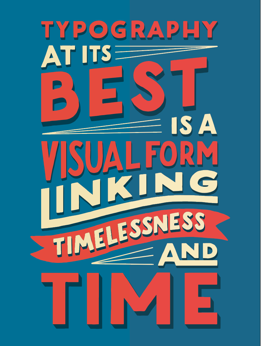
For my piece, I was very happy with the colors Illustrator choose even more so than my originals. As you can see from the above sample, Illustrator did a great job of pairing my colors.
I always like finding the correct Pantones to my work because it not only makes the colors more vibrant but it’s also printer friendly.
ADDING TEXTURE
Now for the cherry on top for our beautiful hand-lettered poster, adding texture! Before adding texture let’s do some prep by organizing our layers.
Have your background on its own layer and group your type and graphics and put them on their own layer. You can hit Command C to copy and then Command F to paste in place, to keep things easier. Then create a new layer to add those sweet textures too.

You can download these free textures from Red Peg here so you can have something to play with.

If you want something a little more special, you can purchase a ton of great texture packs made specifically for lettering from Creative Market for a few bucks.
Download those free textures and open the 9_Free_Vector_Grunge_Textures.eps file.

Now select the kind of texture you want to use from this free set and copy and paste it to your art board on its own layer. Go ahead and change the color to your background color and lock your type and background layer to see the texture in it’s full effect.
You may want to keep your texture smaller if you want a more subtle texture. You’ll just need to duplicate the textures a few times over your text, almost like it was a brush. Feel free to rotate and mirror your selected texture, so it doesn’t look like it’s repeating too much.
This may slow down your computer because of all the new anchor points. So be sure to save your work before duplicating your texture.
Once you’re done group all your texture pieces together by hitting Command G. Then feel free to edit or remove any unwanted texture by using the eraser tool.
I like to do this step in Outline mode to help speed up my computer and make it easy to see everything. Just click Command Y to turn it on and off.
You can also quickly change your brush size by clicking the left and right brackets on your keyboard to help make your eraser marks less noticeable.
LOOK AT WHAT YOU MADE!
Damn, that was some work huh? I know this article was crazy long, but I do hope that this in-depth tutorial was helpful for you whether you followed along with my artwork or had the opportunity to vectorize your work.
CRITIQUES NOW AVAILABLE
As most of you know, I’m on an amazing live streaming platform called Twitch where I get to hang out with my fellow creative friends for three hours a day, three times a week talking about everything from creative struggles to personal experiences.
Starting a few weeks back, we started doing live critiques where you can get my professional opinion on your hand lettering work for a low cost $2 donation while I’m streaming.
After I receive your donation, I drop everything I’m doing to give you a 2-minute review of your work. I’ll give you actionable suggestions on things like line weight, composition, color and more so I can better help you make even greater work.
If you are new to Twitch, there are a ton of awesome creative streamers to follow and find inspiration from besides me. So it’s definitely worth making a free account. I hope to see you in the chat!
QUESTIONS, COMMENTS, CONCERNS
I know this tutorial was a doozy and at times pretty basic, but I wanted to make sure I could teach someone who wasn’t necessarily familiar with Adobe without getting too remedial on the program.
So if it got too confusing or if you have any better suggestions on how to improve this tutorial, please leave a comment below. Have fun lettering my friends