Lettering without meaning is just another sentence. I'll use my process to show you how to choose a hand lettering style that will give your work more of an impact.
My favorite part about lettering is that there are endless possibilities when it comes to how you can style a piece. Using different typefaces, colors and compositions you can give more meaning to a message by understanding how to convey a feeling through style.
As artists, we decide on the tone and mood as we see it from our perspective. So even if a whole room of people had the same phrase to hand letter, each drawing would be unique based on that artist’s interpretation.


QUESTIONS TO ASK YOURSELF BEFORE STARTING A LETTERING PROJECT
Regardless if you’re creating a hand lettering piece for yourself or professionally for a client you need to ask the right questions to discover how you want to interpret the message. Try asking the below questions for every new piece you create so you can define the goals for how you want your lettering to come across.
1. Who is this project for and why does it matter?
When you're working on a new project the most important question is “Who you are trying to attract with your design?” I’m talking more than just demographics like age and location but rather who those individuals are, where they hang out and what they're interested in.
Once you decide on who your target audience is you can start to paint a picture in your mind on how you want to attract them. Take these two logo design examples below that I’ve included into consideration. Although both are targeted towards the design industry, each has a very different audience.


The first design is for Millo a well-established blog for young and seasoned designers from all over the globe. This design needed to look young, bold and simple so it could attract designers while not overpowering the content on Millo’s blog.
The next logo is for a fashionable design firm in Nigeria whose clients are mainly in upscale industries like jewelry, apparel and niche boutiques. That’s why this design is elegant, organic and lightweight so it would get noticed when used front and center on collateral and promotional materials.
2. How do you want people to feel when they see this piece?
You can make your message stronger by having the visual of the letters match the tone of the message. Looking at the below samples, you can see that both designs depict the same word “Love” but each makes you feel something completely different.


Knowing where your piece will live in the real world will guide you on how to create the composition along with any restrictions you might run into. You need to think of all possible locations and applications so you can decide not only on the orientation but also on how you will produce the piece.
For example, if you’re creating a personal project just for social media then it would make the most sense to stay in a square ratio format and to create your graphics for web only. No need to vector an image if it’s only going to live on the internet.
4. What are the most important words of this piece?
Visual hierarchy is how we organize words into different levels of importance. By giving more weight to significant words you can showcase a particular tone with your piece while also teaching viewers how to read your phrase.


Just look at these two samples from various hand lettering artists above and how they stylized the most important words in the phrase. Giving a piece visual hierarchy like this will create more appealing compositions that will tell the viewer which words you want to be emphasized as they read it.
HOW I CHOOSE AN ART DIRECTION FOR MY LETTERING
Now that we understand some key questions to ask ourselves let's decide on what styles we should choose that best correlate with our goals.
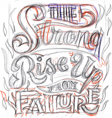
I’m going to break down the art direction behind a new commission I designed for a recent raffle winner from Twitch to give you some more real world examples on how to choose a hand lettering style.
Composition
 This particular piece was to be printed on an 18x24 poster as well a shirt, so I knew immediately that this design needed to be in a portrait format. So when I started on initial sketches, I first drew out the aspect ratio of my art board to make sure my lettering could fit in the space I needed.
Then I began to draw the skeleton of my letters to help visualize different ways to write out the phrase. By writing the letters in your own handwriting quickly like this will give you room play till you find just the right visual hierarchy
Typeface
By understanding how you want people to feel along with who you're targeting is how you decide on what style typeface to use.
First, we decide whether we want all capitals, title case of a mix of both. For this piece, my client wanted something bold and masculine, so it would make sense to make the supporting type in all caps vs. lowercase.
Then you decide between san serif, serif, blackletter, script, representational or sign painting styles for your lettering. Don't be afraid to get messy during this phase and make tweaks and improvements to your work as you create more and more sketches. Each style gives off a distinct tone, so it’s important to experiment with different styles till you get just the right mood.
For this project, I ultimately decided to go with a sharp script for my keywords with a hard thick serif for my supporting type. Typically you can stay safe using 2 to 3 typefaces in a hand lettered piece, or you could use just one typeface but using different weights and variations of that style throughout the piece to keep it interesting.
Weight
When people think of weight, they typically just think of regular, italicized and bold, but there are way more options out there. You can have a style where the letters are more condensed, so they’re taller than they are wide, or go with a really wide style where the letters are stretched out horizontally to fit the space better.

Decorations
They’re a lot of great options when it comes to decorating your letters where you can add lines, arrows, or drop shadows to make certain words pop off the page. You can also add embellishments and simple illustrations within the negative space between the letters to make the piece look more grounded and balanced
For example on this piece I decided to add some fire illustrations to help illustrate the rising from failure, ultimately making “failure” the source of the flame.
Color
Lastly, we have color which can really make your hand lettering come alive. You can add color traditionally with markers, pens, watercolor or good old fashioned crayons if you like. Or you can add color more quickly using Photoshop or Illustrator.

When thinking of color refer to the tone of the piece first and select what your key color will be. Then let that first color guide you to the others. I like to use dribbble for all my color inspiration as a good place to start; then I’ll usually tweak the colors from there.
For this piece, it was important to have the focus remain on the letters themselves by keeping it just black and white. Then for a more organic hand drawn look I inverted my sketch in Photoshop to give it more of a chalkboard look so it would have a high contrast against a black shirt and poster.
STAY ALIGNED WITH YOUR GOALS
Use this art direction outline as a guide to help you navigate your next hand lettering project. Ask the right questions and discover the goals for every project you work on whether it’s just for practice or a commission for a client.
But most importantly do the experimentation necessary to find the right style to make your hand lettered designs more meaningful. With your tool belt of composition, typefaces, weight, decorations, and color you will be well on your way to creating unique hand lettering styles.